Apply animation on WPF control visibility change
Eventtrigger
<DockPanel Background="#bdbec0"  MouseEnter="showTopMenu_MouseEnter" HorizontalAlignment="Stretch" Height="55" >
    <DockPanel.Triggers>
        <EventTrigger RoutedEvent="DockPanel.MouseEnter">
            <BeginStoryboard>
                <Storyboard>
                    <DoubleAnimation Storyboard.TargetProperty="Opacity" Storyboard.TargetName="TopMenuArea"
                        From="0.0" To="1.0" Duration="0:0:1"></DoubleAnimation>
                </Storyboard>
            </BeginStoryboard>
        </EventTrigger>
        <EventTrigger RoutedEvent="DockPanel.MouseLeave">
            <BeginStoryboard>
                <Storyboard>
                    <DoubleAnimation Storyboard.TargetProperty="Opacity" Storyboard.TargetName="TopMenuArea"
                        From="1.0" To="0" Duration="0:0:1"></DoubleAnimation>
                </Storyboard>
            </BeginStoryboard>
        </EventTrigger>
    </DockPanel.Triggers>
    <Button HorizontalAlignment="Center" VerticalAlignment="Center">Down</Button>
</DockPanel>
<DockPanel Background="#151515" LastChildFill="True" Visibility="Collapsed" Opacity="0" Name="TopMenuArea"  Height="55">
</DockPanel>
Or use a style for fade in and out (with mouse enter / exit eventhandler like you did it)
<Style TargetType="FrameworkElement" x:Key="VisibleAnimation">
  <Setter Property="Visibility" Value="Collapsed"/>
  <Setter Property="Opacity" Value="0"/>
  <Style.Triggers>
    <Trigger Property="Visibility" Value="Visible">
      <Trigger.EnterActions>
        <BeginStoryboard>
          <Storyboard>
            <DoubleAnimation Storyboard.TargetProperty="Opacity"
                             From="0.0" To="1.0" Duration="0:0:0.2"/>
          </Storyboard>
        </BeginStoryboard>
      </Trigger.EnterActions>
    </Trigger>
  </Style.Triggers>
</Style>

<DockPanel Background="#151515" LastChildFill="True" Style="{StaticResource VisibleAnimation}" Name="TopMenuArea"  Height="55">
Just define the style in your App Resources, or in the local Window or UserControl. You reuse the Animation style for any control.
use this in your Stackpanel
<StackPanel Background="Red" HorizontalAlignment="Stretch" >
    <StackPanel.Triggers>
        <EventTrigger RoutedEvent="StackPanel.MouseLeftButtonDown" >
            <BeginStoryboard>
                <Storyboard>
                    <DoubleAnimation Storyboard.TargetProperty="Opacity" Storyboard.TargetName="TopMenuArea"
                From="1.0" To="0" Duration="0:0:1"></DoubleAnimation>
                    <ObjectAnimationUsingKeyFrames Storyboard.TargetName="TopMenuArea"
                        Storyboard.TargetProperty="Visibility">
                        <DiscreteObjectKeyFrame KeyTime="0:0:2" Value="{x:Static Visibility.Collapsed}"/>
                    </ObjectAnimationUsingKeyFrames>
                </Storyboard>
            </BeginStoryboard>
        </EventTrigger>
    </StackPanel.Triggers>
    <Label HorizontalAlignment="Center">Area outside top panel . Clicking here will hide top panel again</Label>
</StackPanel>
It's an old question, but I've put together an open source library to allow fading and/or translation on Visibility changed, Loaded or binding.
You can find it at SciChart.Wpf.UI.Transitionz on Github and on NuGet.
Usage:
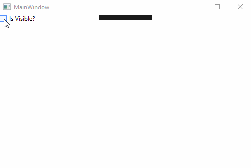
<Window x:Class="WpfApplication15.MainWindow"
        xmlns="http://schemas.microsoft.com/winfx/2006/xaml/presentation"
        xmlns:x="http://schemas.microsoft.com/winfx/2006/xaml"
        xmlns:d="http://schemas.microsoft.com/expression/blend/2008"
        xmlns:mc="http://schemas.openxmlformats.org/markup-compatibility/2006"
        xmlns:tz="http://schemas.abtsoftware.co.uk/transitionz"
        mc:Ignorable="d"
        Title="MainWindow" Height="350" Width="525">
    <Window.Resources>
        <BooleanToVisibilityConverter x:Key="b2vc"></BooleanToVisibilityConverter>
    </Window.Resources>
    <Grid>
        <CheckBox x:Name="CheckBox" Content="Is Visible?" IsChecked="False"></CheckBox>
        <TextBlock Text="Hello World!" FontSize="44" HorizontalAlignment="Center" VerticalAlignment="Center"
            Visibility="Collapsed"
            tz:Transitionz.Opacity="{tz:OpacityParams From=0, To=1, Duration=200, TransitionOn=Visibility}"
            tz:Transitionz.Translate="{tz:TranslateParams From='10,0', To='0,0', Duration=200, TransitionOn=Visibility}"
            tz:Transitionz.Visibility="{Binding ElementName=CheckBox, Path=IsChecked, Converter={StaticResource b2vc}}"/>
    </Grid>
</Window>
Which results in:
here is a sample example
<Grid DockPanel.Dock="Top">
    <DockPanel Background="#bdbec0"
               x:Name="topPanel"
               HorizontalAlignment="Stretch"
               Height="55">
        <Button HorizontalAlignment="Center"
                VerticalAlignment="Center">Down</Button>
    </DockPanel>
    <DockPanel Background="#151515"
               LastChildFill="True"
               Name="TopMenuArea"
               IsHitTestVisible="False"
               Height="55">
        <TextBlock Foreground="White"> some controls here in a horizontal strip , by default its hidden and when some one click on top button its visible and it wil be hidden when some one click outside this area</TextBlock>
        <DockPanel.Style>
            <Style TargetType="DockPanel">
                <Setter Property="Opacity"
                        Value="0" />
                <Style.Triggers>
                    <DataTrigger Binding="{Binding IsMouseOver,ElementName=topPanel}"
                                 Value="true">
                        <Setter Property="Opacity"
                                Value="1" />
                    </DataTrigger>
                </Style.Triggers>
            </Style>
        </DockPanel.Style>
    </DockPanel>
</Grid>
in the sample above I have set IsHitTestVisible="False" on the TopMenuArea dockPanel, as i can see that it is on top of previous (source for trigger panel)
other option is to use the TopMenuArea as the source if it is on the top
sample
<Grid DockPanel.Dock="Top">
    <DockPanel Background="#bdbec0"
               HorizontalAlignment="Stretch"
               Height="55">
        <Button HorizontalAlignment="Center"
                VerticalAlignment="Center">Down</Button>
    </DockPanel>
    <DockPanel Background="#151515"
               LastChildFill="True"
               Name="TopMenuArea"
               Height="55">
        <TextBlock Foreground="White"> some controls here in a horizontal strip , by default its hidden and when some one click on top button its visible and it wil be hidden when some one click outside this area</TextBlock>
        <DockPanel.Style>
            <Style TargetType="DockPanel">
                <Setter Property="Opacity"
                        Value="0" />
                <Style.Triggers>
                    <Trigger Property="IsMouseOver"
                                 Value="true">
                        <Setter Property="Opacity"
                                Value="1" />
                    </Trigger>
                </Style.Triggers>
            </Style>
        </DockPanel.Style>
    </DockPanel>
</Grid>
give it a try and see if it is close to what you are looking for.
both of above just switch the opacity between 0 & 1, you may also use animation to make a fade effect if needed.
This would be a good start. You can just add one c# file and set property like below.
common:VisibilityAnimation.AnimationType="Fade"