Bootstrap 4 flex grid system only
UPDATE (JULY 2019)
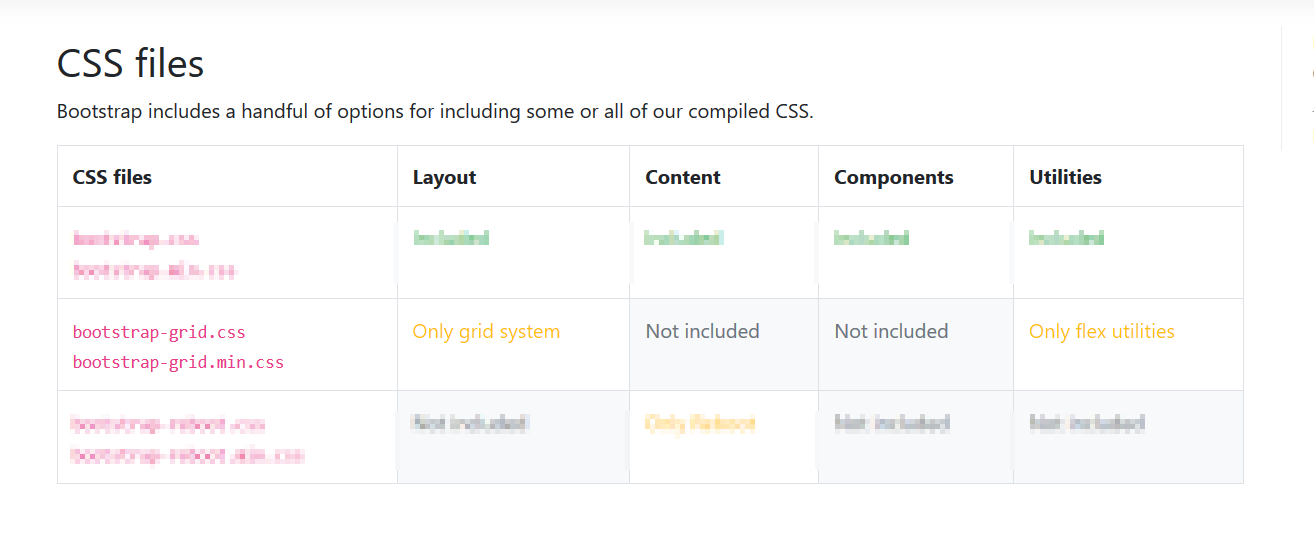
With the release of v4 you can simply use either bootstrap-grid.css or bootstrap-grid.min.css , it only includes grid system and flex utilities
Old Answer:
At this Alpha stage, you can toggle between true/false for using flexbox (if using a CSS preprocessor) as per bootstrap V4 Alpha docs
Flexbox support has finally come to Bootstrap. Opt-in to the new CSS layout styles with the flick of a variable or the swap of a stylesheet.
How it works:
If you’re familiar with modifying variables in Sass—or any other CSS preprocessor—you’ll be right at home to move into flexbox mode.
- Open the
_variables.scssfile and find the$enable-flexvariable.- Change it from
falsetotrue.- Recompile, and done!
Alternatively, if you don’t need the source Sass files, you may swap the default Bootstrap compiled CSS with the compiled flexbox variation. Head to the download page for more information.
At the time of answering this question, if you download the compiled .zip found here, it comes with a css folder that has three stylesheets,
bootstrap-grid.cssbootstrap-normalize.cssbootstrap.css
The bootstrap-grid file has only the grid CSS and nothing else, which is what you're looking for.