Capsule shape using border-radius without a set width or height?
If you use percentages, it takes the element width to calculate the radius. To have the capsule-shaped element, you need to pass to the border-radius property units like rem or px (neither I know the reason for this, but it works). This is why it works when passing 500px. You can use the same value for line-height and border-radius properties if you want.
.capsule {
    line-height: 48px;
    border-radius: 48px;
}
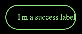
Here you have an example in CodePen. Try to change the variable $label-height to see how the shape is maintained while the height of the button changes.
In this example, you don't need to set the width or height of the element. You just need to adjust the content's height and padding.
The padding property is useful to set a separation between the contents and the component border. See how it looks if I only set the left padding.
If you set the line-height property of the container, you will set automatically the container height, and center the content inside the container at the same time.
If you want to set the component's width to the component's content width, you can set the component's display property to inline-block, and use FlexBox to arrange them in a column, for example. And then, set the left and right margins to auto, to avoid the element to grow to its parent width.
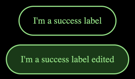
And if you want to leave a space between the components, you can set the margin-top property between consecutive components.
.capsule + .capsule {
    margin-top: 15px;
}
Hope it helps :)
This can be easily achieved using HTML Span. You have to just set the background-color and border-radius.
span {
  background-color: #30bb36;
  border-radius: 10px;
  padding-left: 10px;
  padding-right: 10px;
}
<!DOCTYPE html>
<html>
<body>
<p>Set a <span>Background Color</span> for only a part of a text.</p>
<span>One</span>
<span>Two</span>
<span>Three</span>
<span>Four</span>
</body>
</html>Applying a very large border radius seems to work on many browsers (IE9+, FF, Chrome) like this mod of David's fiddle http://jsfiddle.net/cthQW/1/
border-radius: 500px;
Yes, this is possible (albeit I've only tested in Chromium 28/Ubuntu 12.10):
div {
    /* this is the only relevant part: */
    border-radius: 20%/50%;

    /* this is irrelevant, and just so the element can be visualised/displayed: */
    width: 50%;
    height: 5em;
    margin: 2em auto;
    background-color: #000;
}
JS Fiddle demo.
The important information is, obviously, the 20%/50% property-value; the 20% is the 'horizontal length' of the radius, whereas the 50% is the 'vertical length'; using two different measurements gives an elliptical curve to the border, instead of a single measurement, which yields the more circular radius. Obviously this requires a certain amount of adjustment to your own requirements
References:
border-radius(at Mozilla Developer Network).- CSS Backgrounds and Borders Module Level 3: 5.1. Curve Radii: the ‘border-radius’ properties.