CSS box shadow around a custom shape?
You should use from filter in your CSS then set the drop-shadow($yourshadow) function for value. There is no difference to write shadow for filter: drop-shadow($yourshadow) function or shadow: $yourshadow as a property. You can write like below:
.shape1, .shape2{
  transform: rotate(35deg);
  background: yellow;
  height: 100px;
  width: 100px;
  display: inline-block;
}

.myshape{
  margin: 30px;
  filter: drop-shadow(4px 4px 10px rgba(0,0,0,0.5));
}
<div class="myshape">
<div class="shape1"></div>
<div class="shape2"></div>
</div>Enjoy...
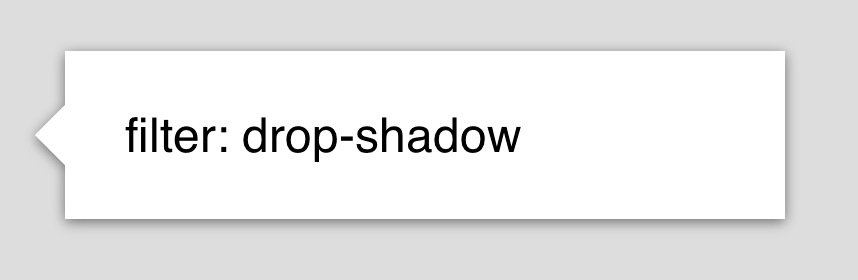
Use drop-shadow:
maybe this article (box-shadow-vs-filter-drop-shadow) will help you
It's probably not in your best interest to do this, I would leave it as is.
http://css-tricks.com/triangle-with-shadow/
You can skip down to "The Double-Box Method" and it shows a very manual way of doing this using :before and :after (which you already used up making the bubble) with the help of transform. If you really wanted to do this, you could float the arrow to the left and apply shadows through the pseudo elements.