Detect change in orientation using javascript
You can use mediaMatch to evaluate CSS media queries, e.g.
window
    .matchMedia('(orientation: portrait)')
    .addListener(function (m) {
        if (m.matches) {
            // portrait
        } else {
            // landscape
        }
    });
CSS media query fires before the orientationchange. If you are looking to capture the end of the event (when the rotation has been completed), see mobile viewport height after orientation change.
NOTE: orientationChange is deprecated
Instead use screen.orientation using the screenOrientation interface
var orientation = (screen.orientation || {}).type || screen.mozOrientation || screen.msOrientation;
if (orientation === "landscape-primary") {
console.log("That looks good.");
} else if (orientation === "landscape-secondary") {
console.log("Mmmh... the screen is upside down!");
} else if (orientation === "portrait-secondary" || orientation === "portrait-primary") {
console.log("Mmmh... you should rotate your device to landscape");
} else if (orientation === undefined) {
console.log("The orientation API isn't supported in this browser :(");
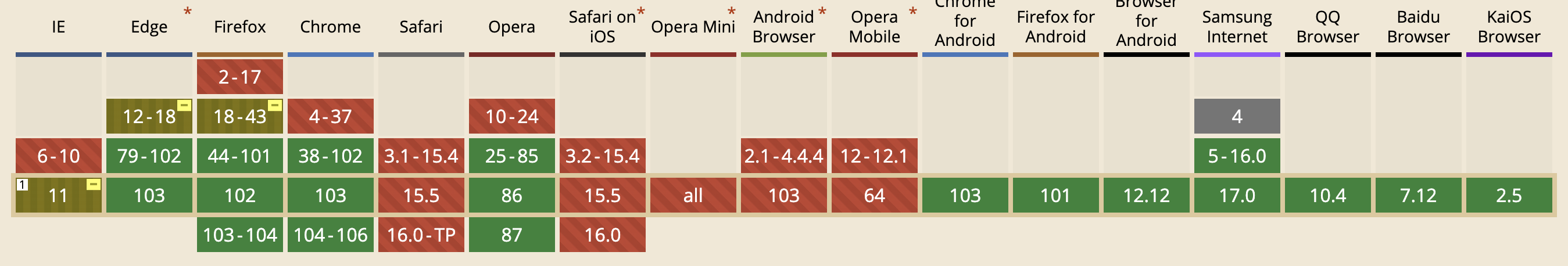
}However note the support as of July 2022
The screen.orientation is not supported by Safari at all
Older answers
The older orientationChange should still work for Safari
window.addEventListener("orientationchange", function() {
  alert(window.orientation);
}, false);
MDN:
window.addEventListener("orientationchange", function() {
    alert("the orientation of the device is now " + screen.orientation.angle);
});
or jQuery mobile orientationchange
$(window).on("orientationchange", function( event ) {
  $("#orientation").text( "This device is in " + event.orientation + " mode!");
});
Older answer
http://www.nczonline.net/blog/2010/04/06/ipad-web-development-tips/
Safari on the iPad does support the window.orientation property, so if necessary, you can use that to determine if the user is in horizontal or vertical mode. As reminder of this functionality:
window.orientation is 0 when being held vertically
window.orientation is 90 when rotated 90 degrees to the left (horizontal)
window.orientation is -90 when rotated 90 degrees to the right (horizontal)
There is also the orientationchange event that fires on the window object when the device is rotated.
You can also use CSS media queries to determine if the iPad is being held in vertical or horizontal orientation, such as:
<link rel="stylesheet" media="all and (orientation:portrait)" href="portrait.css">
<link rel="stylesheet" media="all and (orientation:landscape)" href="landscape.css">
http://www.htmlgoodies.com/beyond/webmaster/toolbox/article.php/3889591/Detect-and-Set-the-iPhone--iPads-Viewport-Orientation-Using-JavaScript-CSS-and-Meta-Tags.htm
<script type="text/javascript">
var updateLayout = function() {
  if (window.innerWidth != currentWidth) {
    currentWidth = window.innerWidth;
    var orient = (currentWidth == 320) ? "profile" : "landscape";
    document.body.setAttribute("orient", orient);
    window.scrollTo(0, 1);
  }
};

iPhone.DomLoad(updateLayout);
setInterval(updateLayout, 400);
</script>