How Center Components Using Flex in React Native?
Easiest way:
    <View style={{jusifyContent: "center", alignItems: "center"}}>
      <Text>I'm an element</Text>
      <Text>I'm another element</Text>
    </View>
If you want to do it without flex, you can do something like this:
<View style={styles.cardContent}>
    //white square
</View>
// This code is responsible for centering the square box in the picture:
cardContent: {
    marginTop:19,
    height:188,
    width:188,
    backgroundColor:'#FFFFFF',
    justifyContent:'center',
    marginLeft:'auto',
    marginRight:'auto',
}
This will be the output:
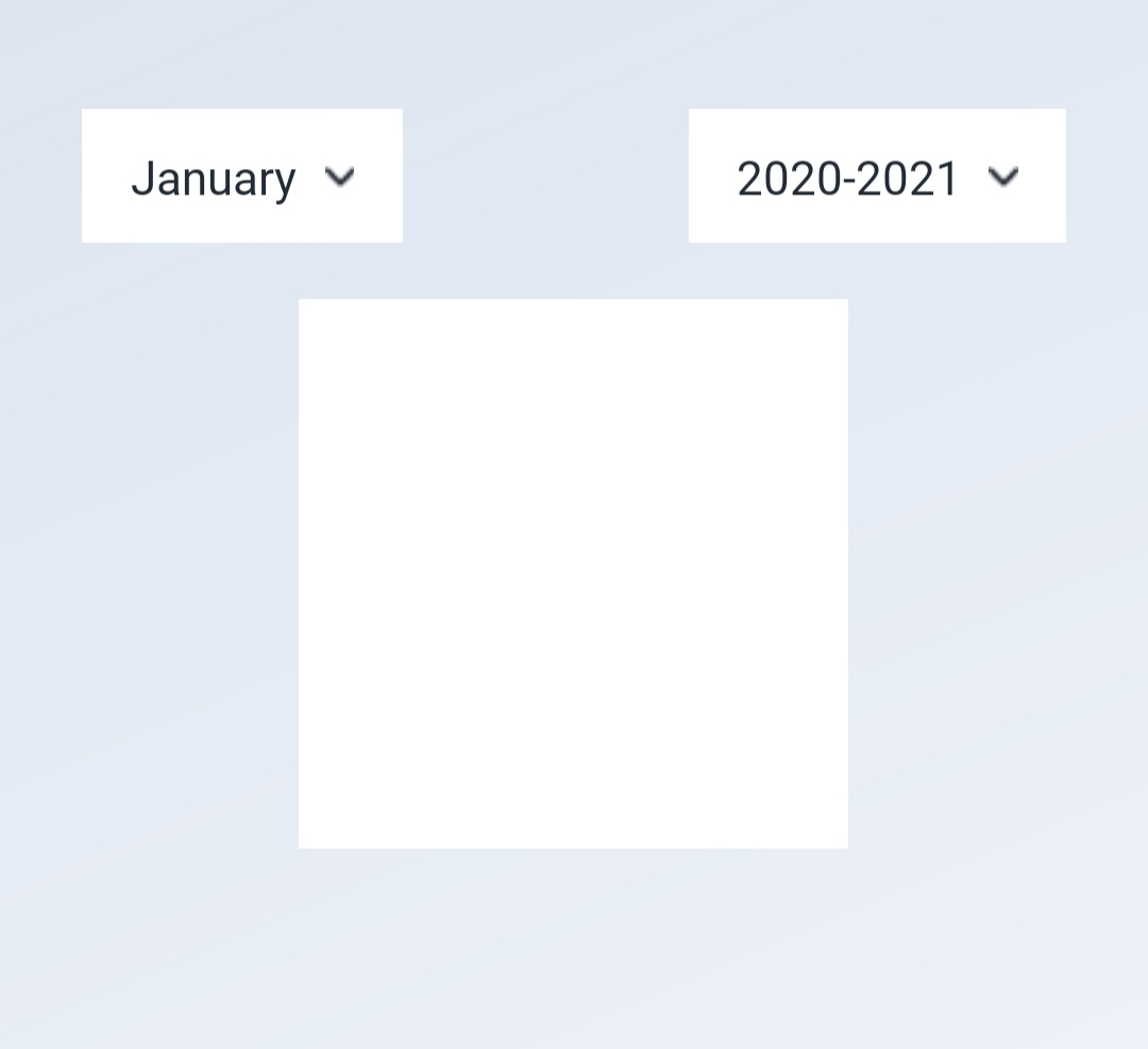
It's Done:
import { Container, Content, Form, Input, Label, Item } from 'native-base';
import React from 'react';
import { StyleSheet } from 'react-native';

import AppLogo from '../components/AppLogo';

const styles = StyleSheet.create({
  container: {},
  content: {
    alignItems: 'center',
    flex: 1,
    justifyContent: 'center'
  },
  form: {
    width: '100%'
  },
  item: {}
});

const Screen = () => (
  <Container style={styles.container}>
    <Content contentContainerStyle={styles.content}>
      <AppLogo />
      <Form style={styles.form}>
        <Item floatingLabel last>
          <Label>Username</Label>
          <Input />
        </Item>
      </Form>
    </Content>
  </Container>
);

export default Screen;
You may want to spend some time reading through the Layout with Flexbox page in the React Native documentation; as this will give you a better idea of how to achieve what you're looking for.
You can access the React Native Flexbox documentation I referred to at: https://facebook.github.io/react-native/docs/flexbox.html
In React Native, a component can specify the layout of its children using the flexbox algorithm. Flexbox is designed to provide a consistent layout on different screen sizes.
You've already used a bit of Flexbox, whether or not you were aware, with the CSS styles flex: 1; and alignItems: 'center';.
Solution
In React Native, Flexbox works the same was as on the web except the defaults are different, with flexDirection defaulting to column instead of row.
For this reason, we can use the alignItems rule to a component's style to determine the alignment of children along the secondary axis (vertical).
Adding the following rule to your children elements will cause them to take the full screen width; however, consider adding a max-width for landscape layouts and larger screens (e.g. a tablet):
childSelector {
    alignItems: stretch;
}
To center your container contents both horizontally and vertically, apply the following styling rules:
alignItems: 'center'
justifyContent: 'center'