How to make one circle inside of another using CSS
You don't need extra elements in CSS3
You can do it all with one element and a box-shadow.
JSFiddle Demo.
CSS
#outer-circle {
    background: #385a94;
    border-radius: 50%;
    height:300px;
    width:300px;
    position: relative;
    box-shadow: 0 0 0 100px black;
    margin:100px;
}
If you want to use only one div to add circle inside circle, then use box-shadow.
div {
  border-radius: 50%;
  box-shadow: 0px 0px 0px 10px red, 0px 0px 0px 20px green, 0px 0px 0px 30px yellow, 0px 0px 0px 40px pink;
  width: 100px;
  height:100px;
  margin: 3em;
}<div></div>Solved this by using CSS transform property:
You can refer to this JS fiddle link for below output:
http://jsfiddle.net/suprabhasupi/74b1ptne/
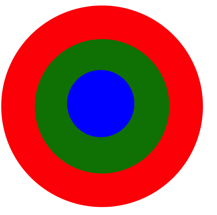
div {
  border-radius: 50%;
  /* border: 1px solid red; */
}

.circle1 {
  position: relative;
  width: 300px;
  height: 300px;
  background-color: red;
}

.circle2 {
  transform: translate(25%, 25%);
  width: 200px;
  height: 200px;
  background-color: green;
}

.circle3 {
   transform: translate(48%, 46%);
  width: 100px;
  height: 100px;
  background-color: blue;
}
<div class="circle1">
<div class="circle2">
<div class="circle3">
</div>
</div>
</div>Ta da!
Explained in the CSS comments:
 #outer-circle {
   background: #385a94;
   border-radius: 50%;
   height: 500px;
   width: 500px;
   position: relative;
   /*
    Child elements with absolute positioning will be
    positioned relative to this div
   */
 }
 #inner-circle {
   position: absolute;
   background: #a9aaab;
   border-radius: 50%;
   height: 300px;
   width: 300px;
   /*
    Put top edge and left edge in the center
   */
   top: 50%;
   left: 50%;
   margin: -150px 0px 0px -150px;
   /*
    Offset the position correctly with
    minus half of the width and minus half of the height
   */
 }
<div id="outer-circle">
<div id="inner-circle">
</div>
</div>