How to put multiple Bootstrap inputs on same line?
You can use Inline Forms like in the Bootstrap Documentation found here: https://getbootstrap.com/docs/3.4/css/#forms-inline
The 'form-inline' class is probably what you're looking for.
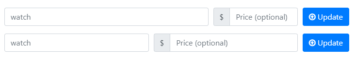
Solution 1 - Using the Grid
Use the Bootstrap’s predefined grid classes for arranging the form elements.
The grid gives you a better control over the width of the elements and scales better than the Inline Form solution.
<form>
<div class="form-row">

   <div class="form-group col-md-7">
       <input type="text" class="form-control" name="watch" value="" placeholder="watch">
    </div>

   <div class="form-group col-md-3">
   <div class="input-group">
        <div class="input-group-prepend">
          <div class="input-group-text">$</div>
        </div>
        <input type="text" class="form-control" id="price0" placeholder="Price (optional)">
   </div>
  </div>

  <div class="form-group col-md-2">
    <button type="submit" class="btn btn-primary" onclick="update($(this));"><i class="fa fa-arrow-circle-o-up" aria-hidden="true"></i> Update</button>
  </div>

</div>
</form>
Solution 2: Inline Form:
Use an Inline Form, as described by Bootstrap Inline Form Documentation. You need to manually address the width and alignment.

<form class="form-inline">
  <div class="form-group">
    <input type="text" class="form-control" name="watch" value="" placeholder="watch">
  </div>

  <div class="input-group m-2">
     <div class="input-group-prepend">
          <div class="input-group-text">$</div>
     </div>
     <input type="text" class="form-control" id="price" placeholder="Price (optional)">
  </div>

  <button type="submit" class="btn btn-primary m-2" onclick="update($(this));"><i class="fa fa-arrow-circle-o-up" aria-hidden="true"></i> Update</button>
</form>
Running Example
This JSFiddle shows both solutions running.
The sample code and fiddle are updated for Bootstrap 4.
Use grid layout with xs phone size to force grid on responsive, the grid is divided into 12 cells so you'll need 3 x 4.
<div class="row">
   <div class="col-xs-4">
   </div>
   <div class="col-xs-4">
   </div>
   <div class="col-xs-4">
   </div>
</div>
You could also have one of them bigger than the others:
<div class="row">
   <div class="col-xs-7">
   </div>
   <div class="col-xs-3">
   </div>
   <div class="col-xs-2">
   </div>
</div>
As long as they add up to 12.
Demo
Bootstrap Grid