Owl Carousel 2 Nav on Sides
I just did this yesterday:)
Firstly make sure nav is turned on in the config
https://owlcarousel2.github.io/OwlCarousel2/docs/api-options.html
   $('#_samewidth_images').owlCarousel({
      margin:10,
      autoWidth:false,
      nav:true,
      items:4,
      navText : ['<i class="fa fa-angle-left" aria-hidden="true"></i>','<i class="fa fa-angle-right" aria-hidden="true"></i>']
  })
This will inject the controls into the DOM, see
https://owlcarousel2.github.io/OwlCarousel2/docs/api-classes.html
<div class="owl-carousel owl-theme owl-loaded">
    <div class="owl-stage-outer">
        <div class="owl-stage">
            <div class="owl-item">...</div>
            <div class="owl-item">...</div>
            <div class="owl-item">...</div>
        </div>
    </div>
    <div class="owl-controls">
        <div class="owl-nav">
            <div class="owl-prev">prev</div>
            <div class="owl-next">next</div>
        </div>
        <div class="owl-dots">
            <div class="owl-dot active"><span></span></div>
            <div class="owl-dot"><span></span></div>
            <div class="owl-dot"><span></span></div>
        </div>
    </div>
</div>
Next use CSS to position the Next and Prev controls, this is what I used:
.owl-prev {
    width: 15px;
    height: 100px;
    position: absolute;
    top: 40%;
    margin-left: -20px;
    display: block !important;
    border:0px solid black;
}

.owl-next {
    width: 15px;
    height: 100px;
    position: absolute;
    top: 40%;
    right: -25px;
    display: block !important;
    border:0px solid black;
}
.owl-prev i, .owl-next i {transform : scale(1,6); color: #ccc;}
For my icons I used Font Awesome but you could use anything similar. Note the navText in the javascript code, this is where you put your custom HTML. I guess you could use an image too (or put it in the background of the .owl-next and .owl-prev divs. Note I used transform to make my arrows higher.
HTML markup
 <div id="slider" class="owl-carousel">
        <div class="item">
            <img src="assets/img/header-img.jpg" alt="" />
        </div>
        <div class="item">
            <img src="assets/img/header-img.jpg" alt="" />
        </div>
        <div class="item">
            <img src="assets/img/header-img.jpg" alt="" />
        </div>
        <div class="item">
            <img src="assets/img/header-img.jpg" alt="" />
        </div>
        <div class="item">
            <img src="assets/img/header-img.jpg" alt="" />
        </div>
    </div>
Css style slider is class name
#slider .owl-nav div.owl-prev,
#slider .owl-nav div.owl-next {
    color: #fff;
    font-size: 18px;
    margin-top: -20px;
    position: absolute;
    top: 50%;
    text-align: center;
    line-height: 39px;
    opacity: 0;
    border:1px solid #fff;
    width: 40px;
    height: 40px;
}
#slider .owl-nav div.owl-prev{
    left: 10%;
    -webkit-transition: 0.4s;
    -moz-transition: 0.4s;
    -o-transition: 0.4s;
    -ms-transition: 0.4s;
}
#slider .owl-nav div.owl-next {
    right: 10%;
    -webkit-transition: 0.4s;
    -moz-transition: 0.4s;
    -o-transition: 0.4s;
    -ms-transition: 0.4s;
}
#slider:hover .owl-nav div.owl-next{
    right: 2%;
    -webkit-transition: 0.4s;
    -moz-transition: 0.4s;
    -o-transition: 0.4s;
    -ms-transition: 0.4s;
    opacity: 1;
}
#slider:hover .owl-nav div.owl-prev{
    left: 2%;
    -webkit-transition: 0.4s;
    -moz-transition: 0.4s;
    -o-transition: 0.4s;
    -ms-transition: 0.4s;
    opacity: 1;
}
#slider:hover .owl-nav div.owl-next:hover,
#slider:hover .owl-nav div.owl-prev:hover{
    color:#fff;
    background: #0C94B8;
    border: 1px solid #0C94B8;
}
slider activation
$('#slider').owlCarousel({
        loop:true,
        items: 1,
        margin:10,
        autoplay: true,
        nav:true,
        navText: ['<i class="fa fa-angle-left" aria-hidden="true"></i>', '<i class="fa fa-angle-right" aria-hidden="true"></i>']
    })
Just a little bit improvment from @KevinSol answer above.
https://stackoverflow.com/a/40449552/10933080
This is my JS code:
    $('.owl-carousel').owlCarousel({
      loop:true,
      margin:10,
      nav:true,
      navText : ['<i class="fa fa-angle-left" aria-hidden="true"></i>','<i class="fa fa-angle-right" aria-hidden="true"></i>'],
    });
and my CSS code:
    .owl-prev, .owl-next {
        width: 15px;
        height: 100px;
        position: absolute;
        top: 50%;
        transform: translateY(-50%);
        display: block !important;
        border:0px solid black;
    }
    .owl-prev { left: -20px; }
    .owl-next { right: -20px; }
    .owl-prev i, .owl-next i {transform : scale(2,5); color: #ccc;}
Customize Owl Carousel 2 Navigation Arrows
Source Link
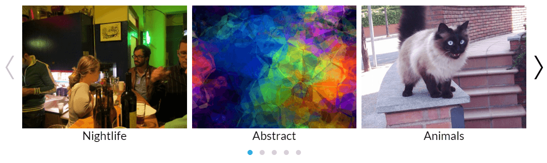
Working Demo Link
Update the navText property
    $('.owl-carousel').owlCarousel({
        margin: 10,
        nav: true,
        navText:["<div class='nav-btn prev-slide'></div>","<div class='nav-btn next-slide'></div>"],
        responsive: {
            0: {
                items: 1
            },
            600: {
                items: 3
            },
            1000: {
                items: 3
            }
        }
    });
Add CSS Style
.carousel-wrap {
    width: 1000px;
    margin: auto;
    position: relative;
}
.owl-carousel .owl-nav{
    overflow: hidden;
    height: 0px;
}

.owl-theme .owl-dots .owl-dot.active span,
.owl-theme .owl-dots .owl-dot:hover span {
    background: #2caae1;
}


.owl-carousel .item {
    text-align: center;
}
.owl-carousel .nav-btn{
    height: 47px;
    position: absolute;
    width: 26px;
    cursor: pointer;
    top: 100px !important;
}

.owl-carousel .owl-prev.disabled,
.owl-carousel .owl-next.disabled{
    pointer-events: none;
    opacity: 0.2;
}

.owl-carousel .prev-slide{
    background: url(nav-icon.png) no-repeat scroll 0 0;
    left: -33px;
}
.owl-carousel .next-slide{
    background: url(nav-icon.png) no-repeat scroll -24px 0px;
    right: -33px;
}
.owl-carousel .prev-slide:hover{
    background-position: 0px -53px;
}
.owl-carousel .next-slide:hover{
    background-position: -24px -53px;
}

span.img-text {
    text-decoration: none;
    outline: none;
    transition: all 0.4s ease;
    -webkit-transition: all 0.4s ease;
    -moz-transition: all 0.4s ease;
    -o-transition: all 0.4s ease;
    cursor: pointer;
    width: 100%;
    font-size: 23px;
    display: block;
    text-transform: capitalize;
}
span.img-text:hover {
    color: #2caae1;
}