TextInputLayout suffix/prefix
There are no standard solutions, I did it with textView right to textInputLayout and editText padding.
        <RelativeLayout
            android:layout_width="match_parent"
            android:layout_height="wrap_content"
            android:layout_marginTop="4dp"
            android:gravity="bottom">

            <android.support.design.widget.TextInputLayout
                android:layout_width="match_parent"
                android:layout_height="wrap_content"
                android:hint="Hint"
                app:errorEnabled="true">

                <android.support.v7.widget.AppCompatEditText
                    style="@style/RegistrationEditText"
                    android:layout_width="match_parent"
                    android:layout_height="wrap_content"
                    android:paddingRight="80dp" />
            </android.support.design.widget.TextInputLayout>

            <android.support.v7.widget.AppCompatTextView
                android:layout_width="wrap_content"
                android:layout_height="wrap_content"
                android:layout_alignParentRight="true"
                android:layout_centerInParent="true"
                android:paddingBottom="12dp"
                android:paddingRight="8dp"
                android:text="rightLabel" />
        </RelativeLayout>
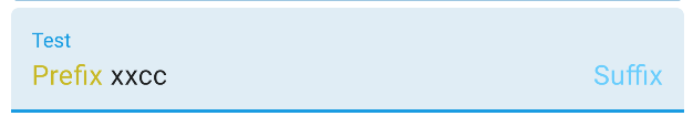
With the TextInputLayout provided in the Material Components Library you can use the attrs:
app:prefixText: prefix textapp:suffixText: suffix text
Something like:
<com.google.android.material.textfield.TextInputLayout
    android:hint="Test"
    app:prefixText="@string/..."
    app:prefixTextColor="@color/secondaryDarkColor"
    app:suffixText="@string/..."
    app:suffixTextColor="@color/primaryLightColor"
    ...>

    <com.google.android.material.textfield.TextInputEditText
        .../>

</com.google.android.material.textfield.TextInputLayout>
Example:
Note: This requires a minimum of version 1.2.0-alpha01.