Twitter Bootstrap 3 inline and horizontal form
Just because the docs suggest you should use the form controls does not mean you have to. You can just use the built-in grid system to achieve the layout. See http://bootply.com/82900 for a working example. Code below:
<script src="https://cdnjs.cloudflare.com/ajax/libs/jquery/3.3.1/jquery.min.js"></script>
<!-- Latest compiled and minified CSS -->
<link rel="stylesheet" href="https://maxcdn.bootstrapcdn.com/bootstrap/3.3.7/css/bootstrap.min.css" integrity="sha384-BVYiiSIFeK1dGmJRAkycuHAHRg32OmUcww7on3RYdg4Va+PmSTsz/K68vbdEjh4u" crossorigin="anonymous">
<!-- Optional theme -->
<link rel="stylesheet" href="https://maxcdn.bootstrapcdn.com/bootstrap/3.3.7/css/bootstrap-theme.min.css" integrity="sha384-rHyoN1iRsVXV4nD0JutlnGaslCJuC7uwjduW9SVrLvRYooPp2bWYgmgJQIXwl/Sp" crossorigin="anonymous">
<!-- Latest compiled and minified JavaScript -->
<script src="https://maxcdn.bootstrapcdn.com/bootstrap/3.3.7/js/bootstrap.min.js" integrity="sha384-Tc5IQib027qvyjSMfHjOMaLkfuWVxZxUPnCJA7l2mCWNIpG9mGCD8wGNIcPD7Txa" crossorigin="anonymous"></script>
<div class="container">
<form role="form">
<div class="row">
<label class="col-xs-4" for="inputEmail1">Email</label>
<div class="col-xs-8">
<input type="email" class="form-control" id="inputEmail1" placeholder="Email">
</div>
</div>
<div class="row">
<label class="col-xs-4" for="inputPassword1">Password</label>
<div class="col-xs-8">
<input type="password" class="form-control" id="inputPassword1" placeholder="Password">
</div>
</div>
<div class="row">
<label class="col-xs-12" for="TextArea">Text Area</label>
</div>
<div class="row">
<div class="col-xs-12">
<textarea class="form-control" id="TextArea"></textarea>
</div>
</div>
<div class="row">
<div class="col-xs-12">
<button type="submit" class="btn btn-default">Sign in</button>
</div>
</div>
</form>
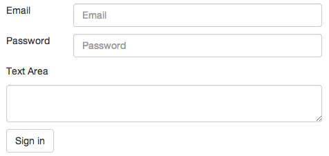
</div>Screenshot of above code rendered:
UPDATE: Just realized I dropped the label tags. Updated the answer, swapping <label> for <div>.
UPDATE: Updating code to reflect need to stay in this layout in small widths, as requested in comments below. See JS fiddle for a working example.
What you are looking for is not really in-line behaviour at all, just horizontal.
This code should help:
<div class="" id="myDialog1">
    <div class="" id="myDialog2">
        <form role="form" class="form-horizontal" id="contactForm" onsubmit="send(); return false;">
            <label>Please fill the form</label>
            <br><br>
            <div class="form-group">
                <label for="name" class="col-lg-3 col-sm-3">My Label 2</label>
                <div class="col-lg-7 col-sm-7">
                    <input type="text" class="form-control" name="name" id="name" required="required" value="myName">
                </div>
            </div>

            <div class="form-group">
                <label for="email" class="col-lg-3 col-sm-3">My Label 3</label>
                <div class="col-lg-7 col-sm-7">
                    <input type="email" class="form-control" name="email" id="email" required="required">
              </div>
            </div>

            <div class="form-group">
                <label for="message" class="col-lg-3">My Label 4</label>
                <div class="col-lg-10 col-sm-10">
                     <textarea class="form-control" name="message" id="message" required="required"></textarea>
                </div>
            </div>

            <button type="submit" class="btn btn-primary" id="submit" style="margin-left: 20px">Send</button>
        </form>
    </div>
</div>
And looks like this:

The col-sm-* tags are optional - they just stop the elements from stacking as you size the window down.
You can try it out here: http://bootply.com/82889