Bootstrap table not working correctly on Chrome but works fine on Firefox
Add this class to your <table>
.my-table {
    table-layout: fixed;
    word-wrap: break-word;
}
Updated jsfiddle
It works in md and lg screens though it's not perfect for mobile.
I believe that Chrome is not a fan of scrolling tables, and bootstrap likes to render the table to fit all the data regardless. In Firefox it scrolls, in chrome it doesn't.
One solution is to wrap the table in a scrollable div. Maybe trigger on a smaller screen small screensize to fix Christain's answer?
DEMO: http://jsfiddle.net/9349fe34/
It would be more user friendly, IMO, to make the width auto. It sizes down nicely and the responsive table will kick in at the 767px break point (default).
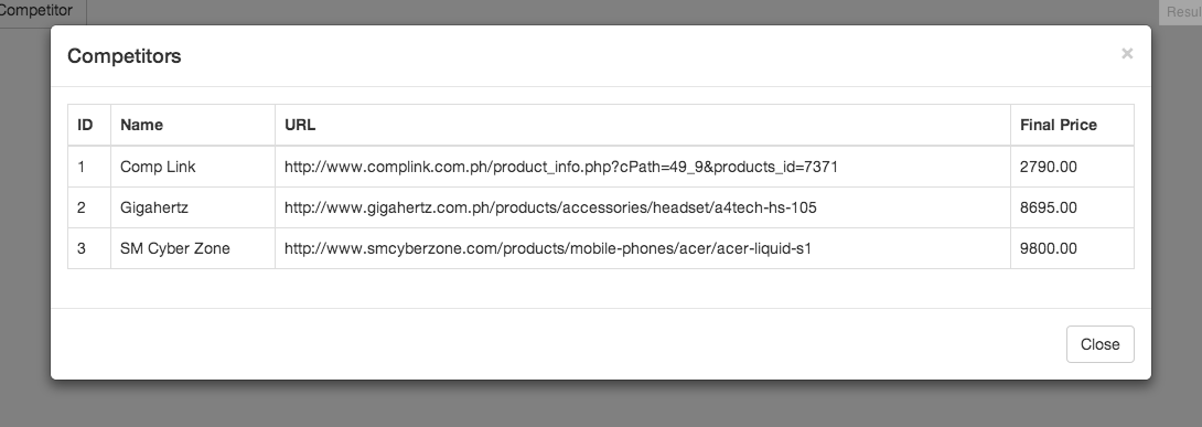
Add class .table-modal to the modal
<div class="modal fade table-modal" id="competitor_modal" tabindex="-1" role="dialog" aria-labelledby="myModalLabel" aria-hidden="true">
Add CSS:
.table-modal .modal-dialog {width:auto;max-width:1000px;}
.table-modal {padding-left:5%;padding-right:5%;} /* put this in a 768px min-width */
And remove the .row and col-*-12 and the .container-fluid inside the modal-body, it's not necessary. The padding on the modal-body will work great.