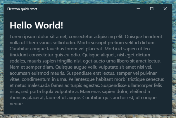
Frameless window with controls in electron (Windows)
Assuming you don't want window chrome, you can accomplish this by removing the frame around Electron and filling the rest in with html/css/js. I wrote an article that achieves what you are looking for on my blog here: http://mylifeforthecode.github.io/making-the-electron-shell-as-pretty-as-the-visual-studio-shell/. Code to get you started is also hosted here: https://github.com/srakowski/ElectronLikeVS
To summarize, you need to pass frame: false when you create the BrowserWindow:
mainWindow = new BrowserWindow({width: 800, height: 600, frame: false});
Then create and add control buttons for your title bar:
 <div id="title-bar">
      <div id="title">My Life For The Code</div>
      <div id="title-bar-btns">
           <button id="min-btn">-</button>
           <button id="max-btn">+</button>
           <button id="close-btn">x</button>
      </div>
 </div>
Bind in the max/min/close functions in js:
(function () {

      var remote = require('remote');
      var BrowserWindow = remote.require('browser-window');

     function init() {
          document.getElementById("min-btn").addEventListener("click", function (e) {
               var window = BrowserWindow.getFocusedWindow();
               window.minimize();
          });

          document.getElementById("max-btn").addEventListener("click", function (e) {
               var window = BrowserWindow.getFocusedWindow();
               window.maximize();
          });

          document.getElementById("close-btn").addEventListener("click", function (e) {
               var window = BrowserWindow.getFocusedWindow();
               window.close();
          });
     };

     document.onreadystatechange = function () {
          if (document.readyState == "complete") {
               init();
          }
     };

})();
Styling the window can be tricky, but the key use to use special properties from webkit. Here is some minimal CSS:
body {
 padding: 0px;
 margin: 0px;
}

#title-bar {
 -webkit-app-region: drag;
 height: 24px;
 background-color: darkviolet;
 padding: none;
 margin: 0px;
}

#title {
 position: fixed;
 top: 0px;
 left: 6px;
}

#title-bar-btns {
 -webkit-app-region: no-drag;
 position: fixed;
 top: 0px;
 right: 6px;
}
Note that these are important:
-webkit-app-region: drag;
-webkit-app-region: no-drag;
-webkit-app-region: drag on your 'title bar' region will make it so that you can drag it around as is common with windows. The no-drag is applied to the buttons so that they do not cause dragging.
I was inspired by Shawn's article and apps like Hyper Terminal to figure out how to exactly replicate the Windows 10 style look as a seamless title bar, and wrote this tutorial (please note: as of 2022 this tutorial is somewhat outdated in terms of Electron).

It includes a fix for the resizing issue Shawn mentioned, and also switches between the maximise and restore buttons, even when e.g. the window is maximised by dragging the it to the top of the screen.
Quick reference
- Title bar height:
32px - Title bar title font-size:
12px - Window control buttons:
46pxwide,32pxhigh - Window control button assets from font
Segoe MDL2 Assets(docs here), size:10px - Minimise:
 - Maximise:
 - Restore:
 - Close:
 - Window control button colours: varies between UWP apps, but seems to be
- Dark mode apps (white window controls):
#FFF - Light mode apps (black window controls):
#171717 - Close button colours
- Hover (
:hover): background#E81123, colour#FFF - Pressed (
:active): background#F1707A, colour#000or#171717
Note: in the tutorial I have switched to PNG icons with different sizes for pixel-perfect scaling, but I leave the Segoe MDL2 Assets font characters above as an alternative