How to add a search box with icon to the navbar in Bootstrap 3?
This is the closest I could get without adding any custom CSS (this I'd already figured as of the time of asking the question; guess I've to stick with this):
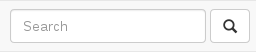
And the markup in use:
<form class="navbar-form navbar-left" role="search">
    <div class="form-group">
        <input type="text" class="form-control" placeholder="Search">
    </div>
    <button type="submit" class="btn btn-default">
        <span class="glyphicon glyphicon-search"></span>
    </button>
</form>
PS: Of course, that can be fixed by adding a negative margin-left (-4px) on the button, and removing the border-radius on the sides input and button meet. But the whole point of this question is to get it to work without any custom CSS.
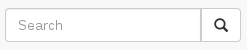
I'm running BS3 on a dev site and the following produces the effect/layout you're requesting. Of course you'll need the glyphicons set up in BS3.
<div class="navbar navbar-inverse navbar-static-top" role="navigation">

    <div class="navbar-header">
        <button type="button" class="navbar-toggle" data-toggle="collapse" data-target=".navbar-ex1-collapse">
        <span class="sr-only">Toggle navigation</span>
        <span class="icon-bar"></span>
        <span class="icon-bar"></span>
        <span class="icon-bar"></span>
        </button>
        <a class="navbar-brand" rel="home" href="/" title="Aahan Krish's Blog - Homepage">ITSMEEE</a>
    </div>

    <div class="collapse navbar-collapse navbar-ex1-collapse">

        <ul class="nav navbar-nav">
            <li><a href="/topic/notes/">/notes</a></li>
            <li><a href="/topic/dev/">/dev</a></li>
            <li><a href="/topic/good-reads/">/good-reads</a></li>
            <li><a href="/topic/art/">/art</a></li>
            <li><a href="/topic/bookmarks/">/bookmarks</a></li>
            <li><a href="/all-topics/">/all</a></li>
        </ul>

        <div class="col-sm-3 col-md-3 pull-right">
        <form class="navbar-form" role="search">
        <div class="input-group">
            <input type="text" class="form-control" placeholder="Search" name="srch-term" id="srch-term">
            <div class="input-group-btn">
                <button class="btn btn-default" type="submit"><i class="glyphicon glyphicon-search"></i></button>
            </div>
        </div>
        </form>
        </div>

    </div>
</div>
UPDATE: See JSFiddle
I tried @PhilNicholas 's code and got the same problem of @its_me said in the comments that search bar show up on the next line of navbar, and I found that form need to be added an attribute width.
<form role="search" style="width: 15em; margin: 0.3em 2em;">
    <div class="input-group">
        <input type="text" class="form-control" placeholder="Search">
        <div class="input-group-btn">
            <button type="submit" class="btn btn-default">
                <span class="glyphicon glyphicon-search"></span>
            </button>
        </div>
    </div>
</form>
You could use the segmented buttons example from Bootstrap 3:
<form action="" class="navbar-form navbar-right">
   <div class="input-group">
       <input type="Search" placeholder="Search..." class="form-control" />
       <div class="input-group-btn">
           <button class="btn btn-info">
           <span class="glyphicon glyphicon-search"></span>
           </button>
       </div>
   </div>
</form>